HOUSE OF L’ORÉAL
Project Scope: Print, Branding, Web Design, Visual Identity
Industry: Real Estate, Beauty
MOVING IS NEVER EASY
Now try moving a Fortune 500 company with 10,000 employees and all their stuff and office furniture. Yikes. Oh and also we’re moving across the city from 575 5th Avenue to Hudson Yards - the largest private real estate development in New York City since Rockefeller Center.
CAMPAIGN SCHEDULE
To keep everyone on track, a high level campaign schedule was created with all parties involved including architects, contractors and designers. L’Oréal’s Hudson Yards initiative is organized around 5 campaigns. Each campaign focuses on a specific aspect of the relocation to Hudson Yards.
COMMUNICATION
With such a tremendous move and makeover, communication between employees and relevant stakeholders were key. Here’s where communication design comes in. The first thing that was set up from the site campaign was a countdown landing page on the L’Oréal intranet to get employees excited while the rest of the site and other assets were in production.
With a landing page setup, now employees would know where to go to find any upcoming news or updates regarding the big move.
LAUNCH
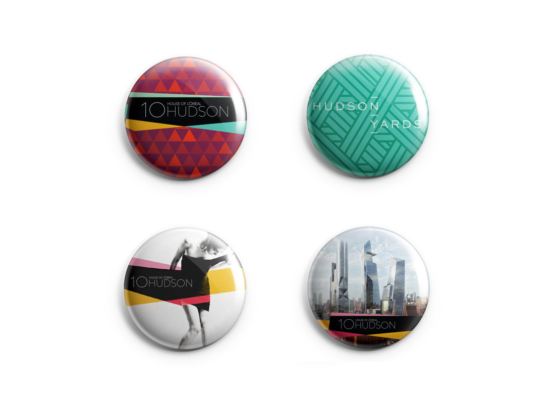
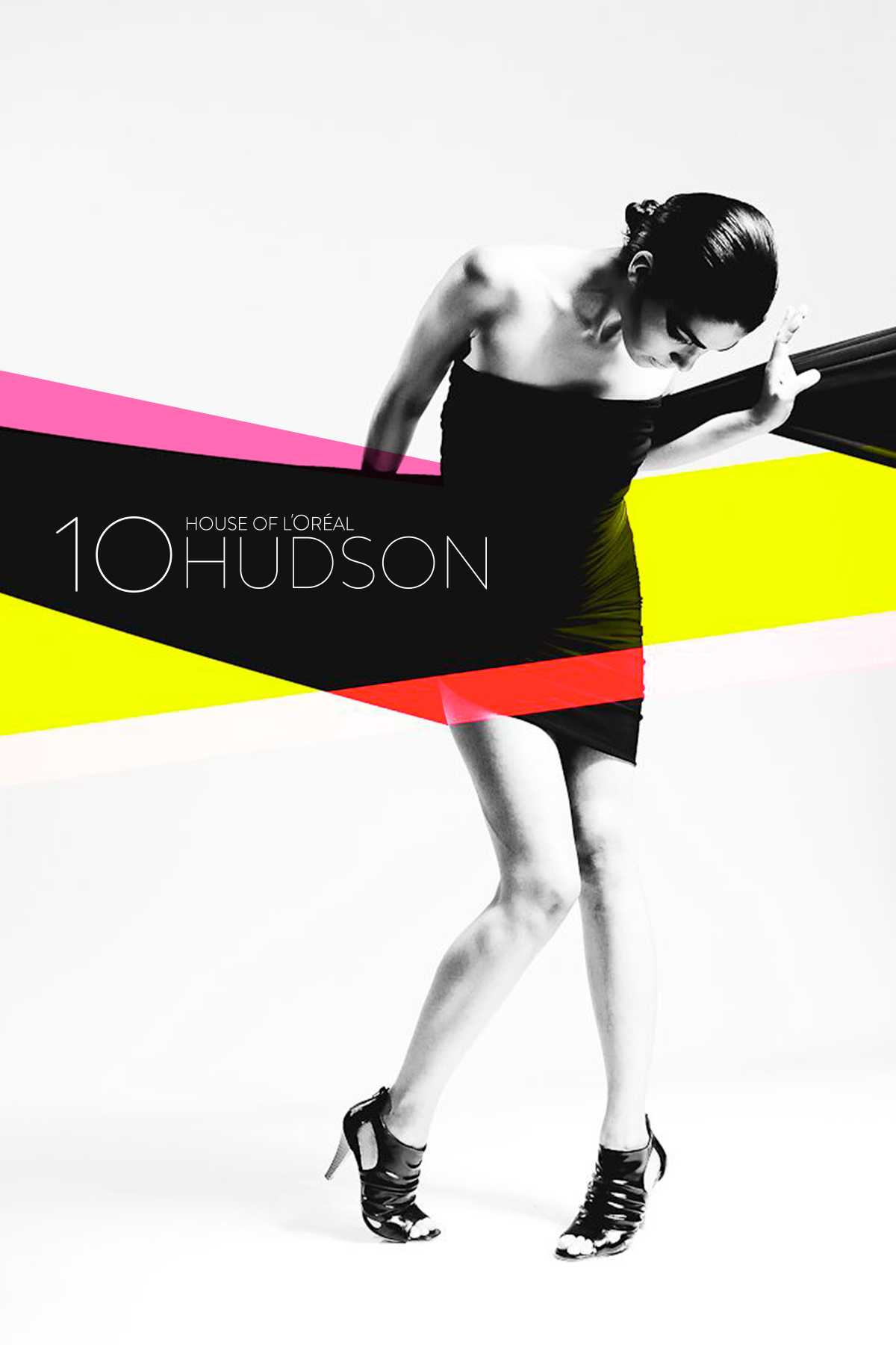
Various print and digital assets including posters, tent cards and pins were created. Focusing on the the new buildings unique architectural lean in it’s shape was the motif for much of the design for all assets.
As the launch for the intranet portal counted down, these assets were distributed through the old 575 5th Ave. office to not only communicate to the employees but also hype up the move to Hudson Yards.
CONSISTENT UPDATES
As we approached the start and end of each campaign, the relevant site pages for each campaign would be designed, developed and released to the rest of the employees.
To keep employees engaged and invested, we began to implement interactive maps to showcase where specific amenities, services and offices would be, as well as neighborhood maps to educate employees where they might grab a bite to eat or where the closest public transit stop is.
HISTORY & HYPE
Along with various print and digital assets to launch the move, a short hype video was also produced. Paying homage to it’s NYC history and roots this quick history lesson was wrapped in a nostalgic 80’s aesthetic and a Wizard of Oz concept sequence to transition to the new modern, House of L’Oréal.
GIF-T GIVING
As the holidays approached the team thought about a fun way of sending each other holiday greeting cards with sustainability in mind (save the trees!). The result was Holiday Gif-t Giving. By designing and creating a few holiday gif templates with the holidays, Hudson Yards and moving in mind, we were able to setup a site to let employees send each other custom holiday gif cards.


